
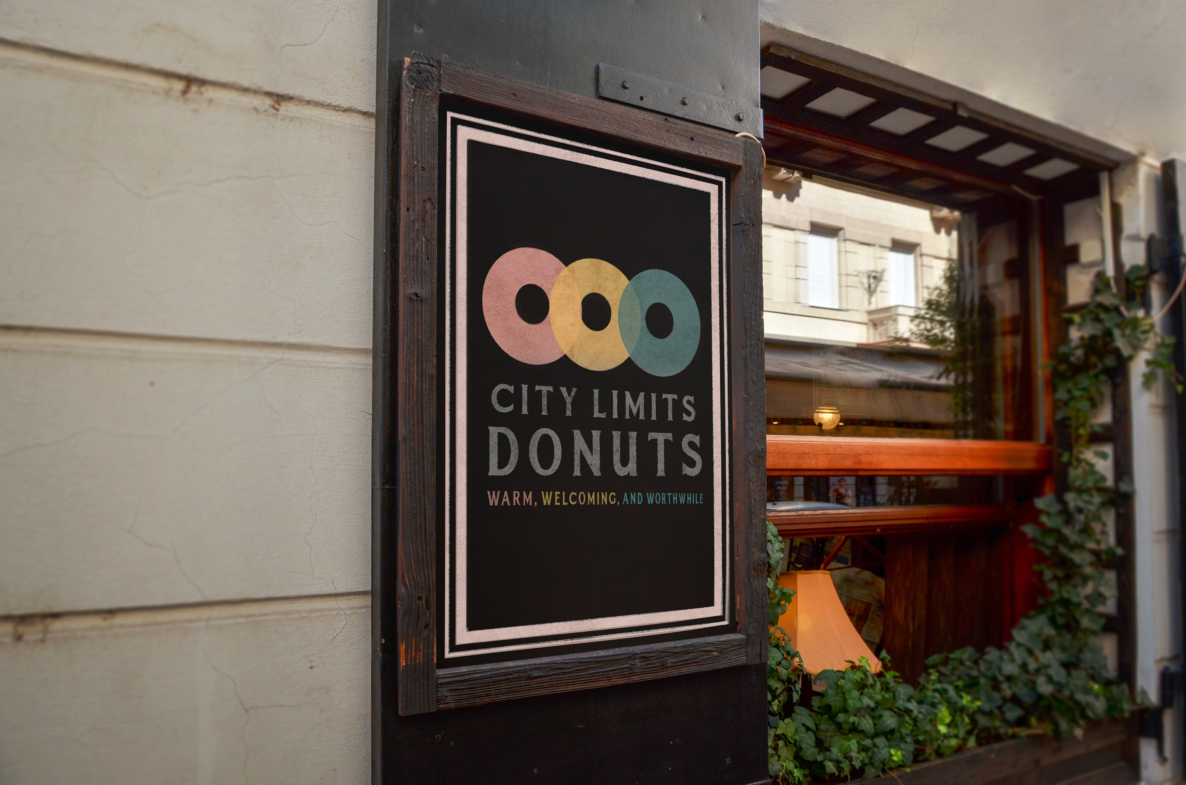
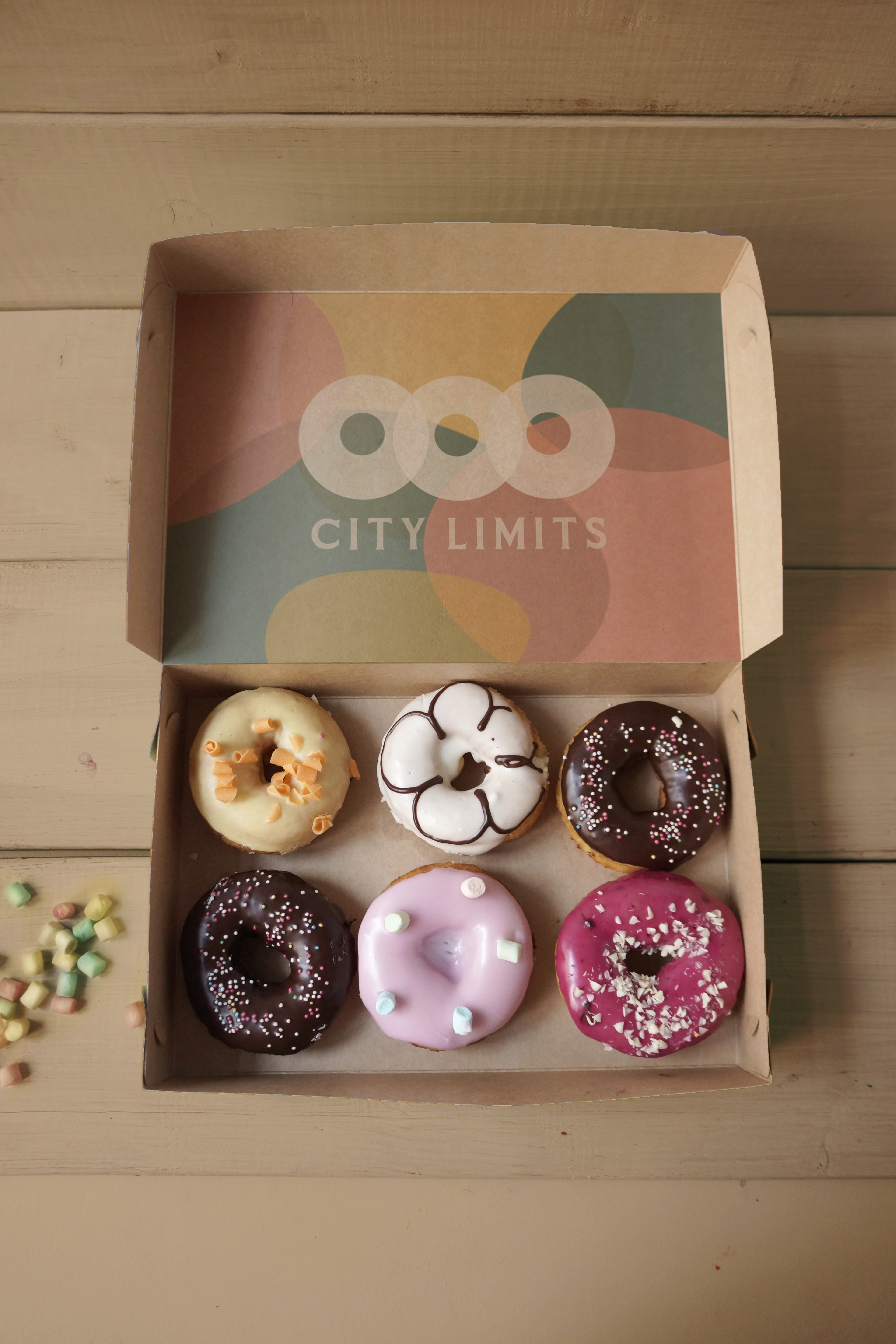
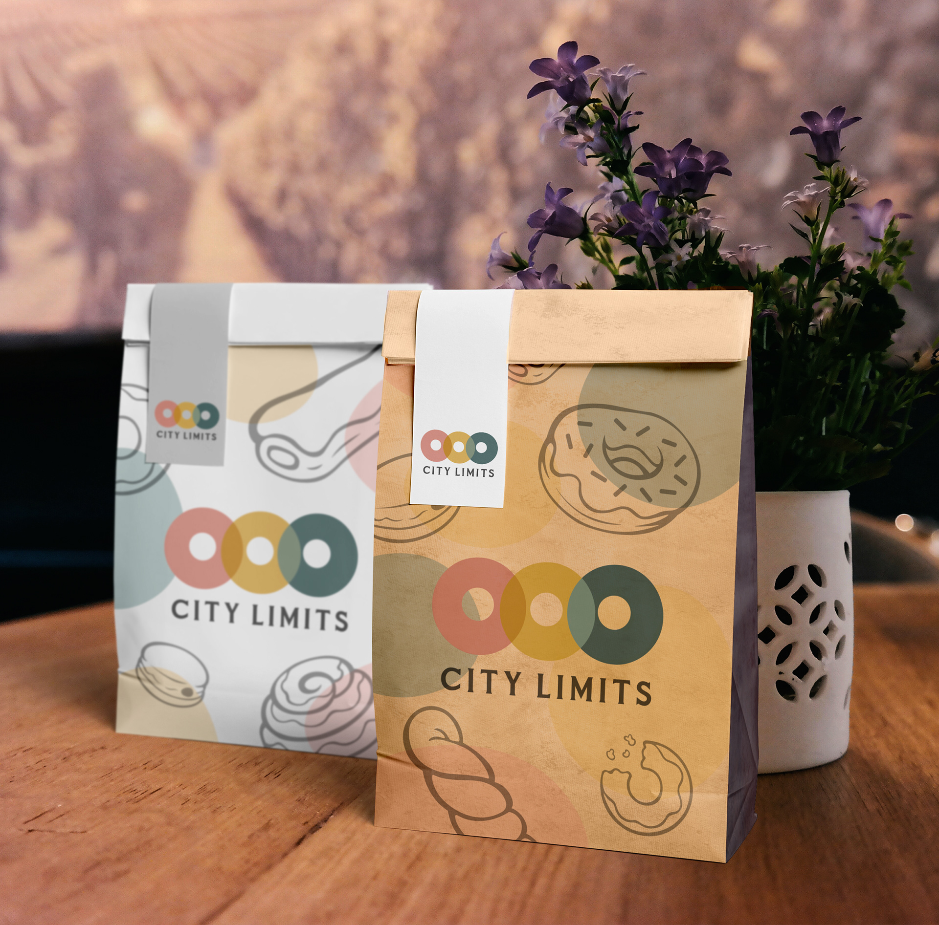
City Limits is equal parts donut shop and café. The designs are meant to invite customers into the same vibrant setting of a donut shop, but also comfort them with the relaxed moods of a café. To achieve this effect, I chose a serene color palette and paired it with elegant typography.
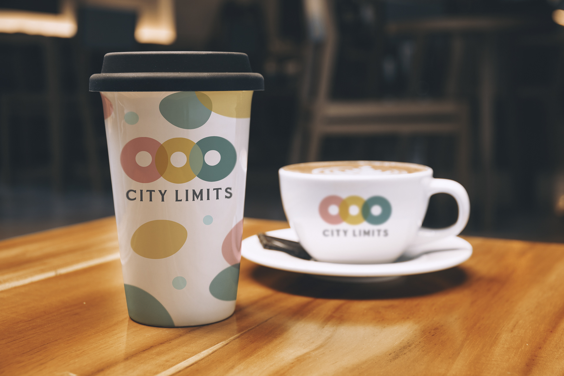
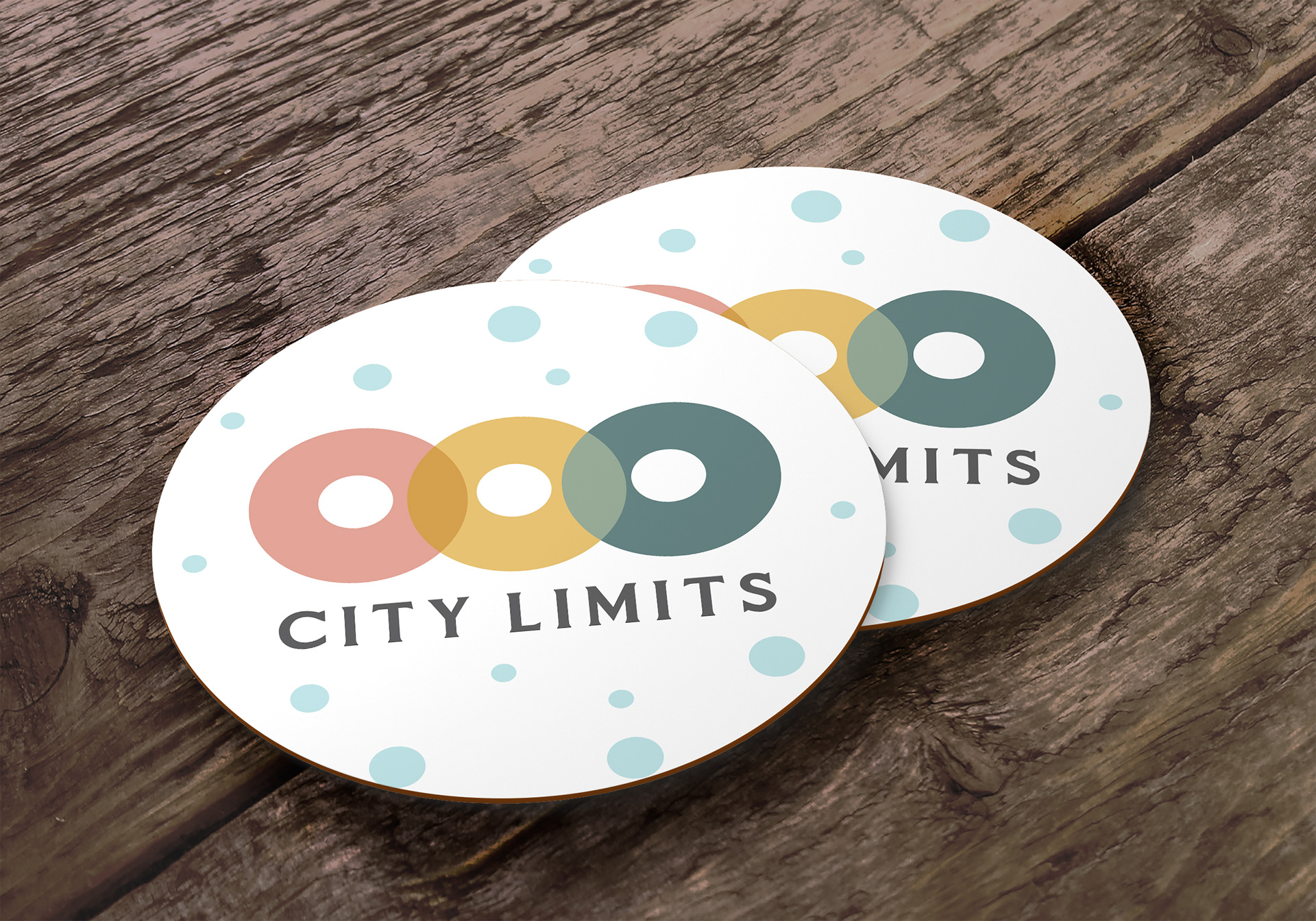
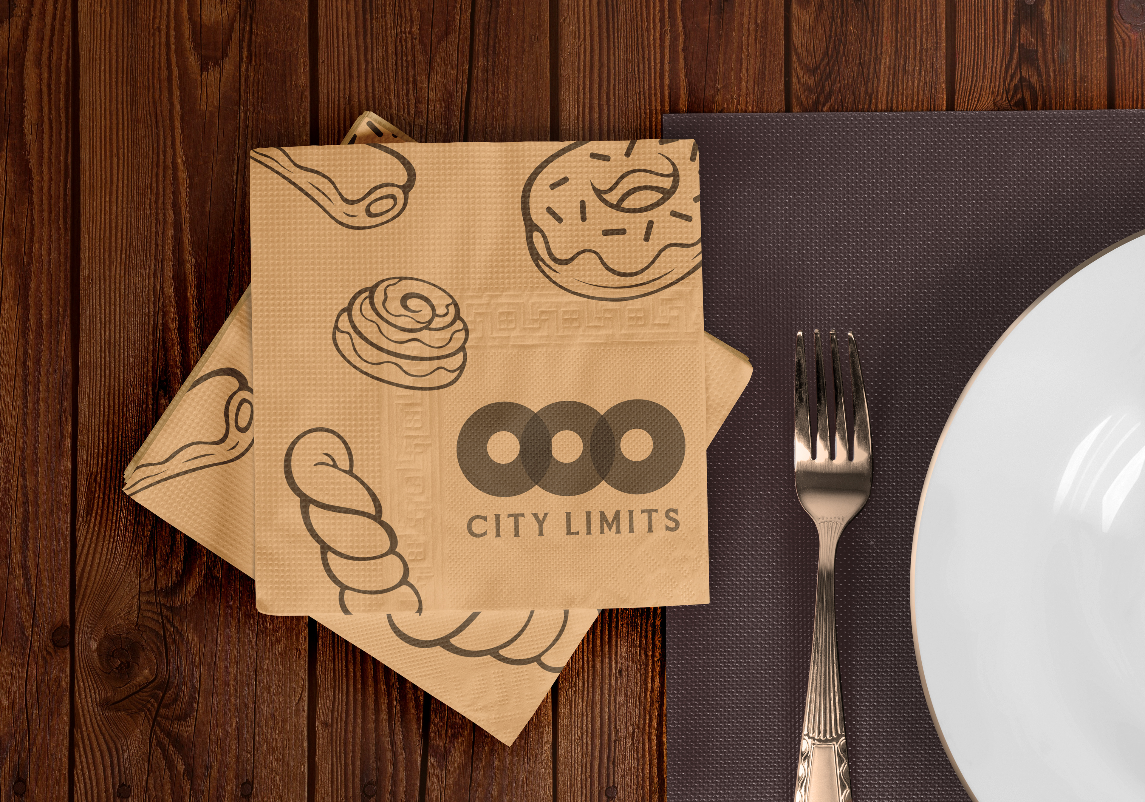
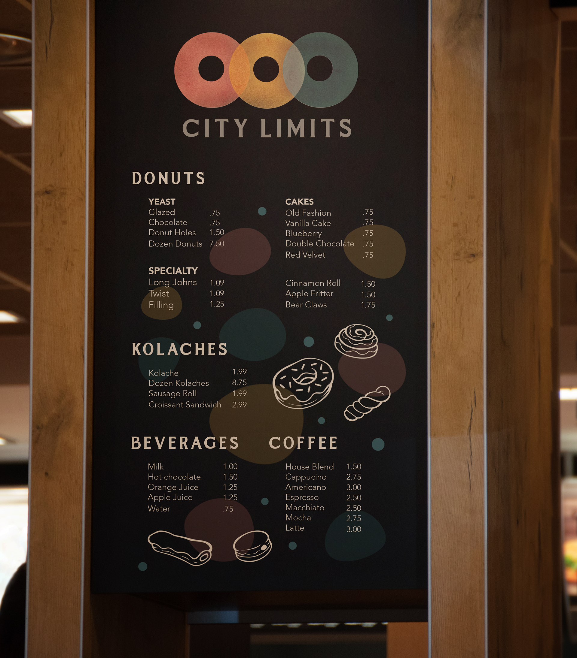
The name "City Limits" is not rhetorical. The donut shop is poised at the edge of a city. While it is predominantly meant to comfort customers with a quiet aura, it does bring some traits of the city with it. The shapes and color scheme of the logo are meant to replicate those of a stoplight.
Though it took considerable development and great care in the branding process, these designs achieved the aesthetic I had been hoping for. They won an AIGA Flux award in 2022.